SAYABC: Teacher Client Redesign
Results
User Feedback: Post-launch feedback from users was overwhelmingly positive. Teachers appreciated the user-friendly interface, with comments like “It's awesome, I really like the new interface. It's definitely more user-friendly than previous versions of the portal,” and “I think the platform is great actually.”
Introduction
I joined SayABC, a sub-company of VIPKID, to work on the redesign of the teacher client. The project aimed to create a scalable, intuitive, and comprehensive client interface.
Total Time
4 Weeks (with a six-month hiatus)
Background
The initial teacher client was lightweight and not designed with scalability in mind. My team included a PM, a UI designer, and an intern.
Goals
Provide a holistic view of teacher accounts.
Ensure scalability for future feature integration.
Design Constraints & Challenges
Overcoming immature UX processes within the company.
Time limitations for both qualitative feedback collection and extensive design work.
A project hiatus after the initial sprint.
Establishing a cohesive design language across platforms (mobile, PC, iPad).
Addressing different information architectures for Eastern and Western users.
Initial Design Process
The initial sprint involved a complete redesign to include a dashboard for essential features:
Upcoming classes.
Task list.
Schedule access.
Quick support access.
Personalized news updates.
Research During Hiatus
During the project hiatus, I conducted Skype interviews with seven teachers to understand their complete lifecycle with SayABC and identify specific pain points with the teacher client. Full report here.
Back on Track: Ideation & Wireframes
After the project resumed, the insights gathered from the research were used to validate and add features like teacher scheduling and improved communication. The client was divided into several sections: a comprehensive dashboard, class management, profile management, and support systems.
Link to full wireframes are here.
Wireframes and User Interface
Dashboard Design: Showed upcoming classes, tasks, weekly schedules, income, and communications.
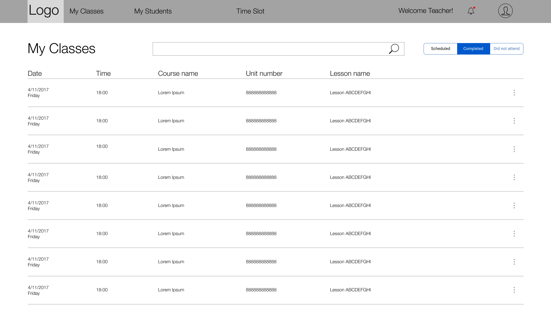
My Classes Page: A list of completed, upcoming, and missed classes, with functionalities for class feedback and attendance.
My Students Page: Initially included a student list arranged by class, later removed from the final scope.
Final Product
The first version of the visual design went live, and I worked with the UI designer on the second version, which included some deviations from the original wireframes but still showcased the significant improvements over the original design.
Concluding Thoughts
Despite challenges like limited research time and disagreements over information architecture, the final design was a success. However, if resources had allowed, I would have conducted a card sort for information architecture, interviewed more users, created a usability prototype, and conducted an ethnographic study to further refine the design and functionality.


